
A friend introduced me to an interesting site with color prompts to inspire new work. The first one was #deepkomaru. I looked through my work and found lots of pieces where I used this color... probably some combo of french ultramarine and burnt sienna, one of my go-to-combos.

#deepkomaru
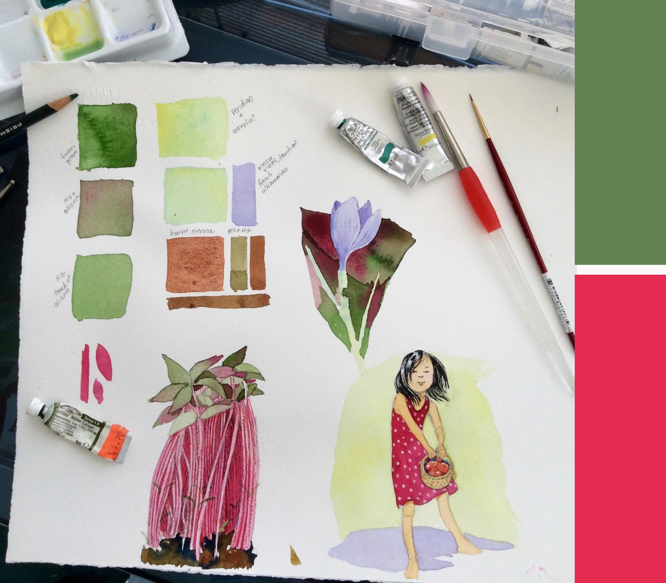
The next week's prompt was #amaranth, but I didn't have time to post anything. The following week was #clovergreen, so I decided to combine the two colors for some experimentation.


I went to Adobe Kuler color schemes
https://color.adobe.com/
plugged in the two colors, and played around with triads, complementary and analagous colors, etc. I liked this combo (not exactly clover green... and tried to match the combo using watercolors.

Kuler color wheel
#WIP #amaranth #clovergreen @colour_collective
It's pretty tough to match screen colors to watercolors, but here is my attempt. The first green was hooker's green with a touch of alizarin. The amaranth was close to alizarin crimson. The light green was really hard to get, but the closest I came was veridian (a blue green) with a touch of lemon yellow (a green-learning yellow). The browns were straight burnt sienna, with varying degrees of hookers green.
At any rate, it was a fun exercise, and I learned a few things along the way.
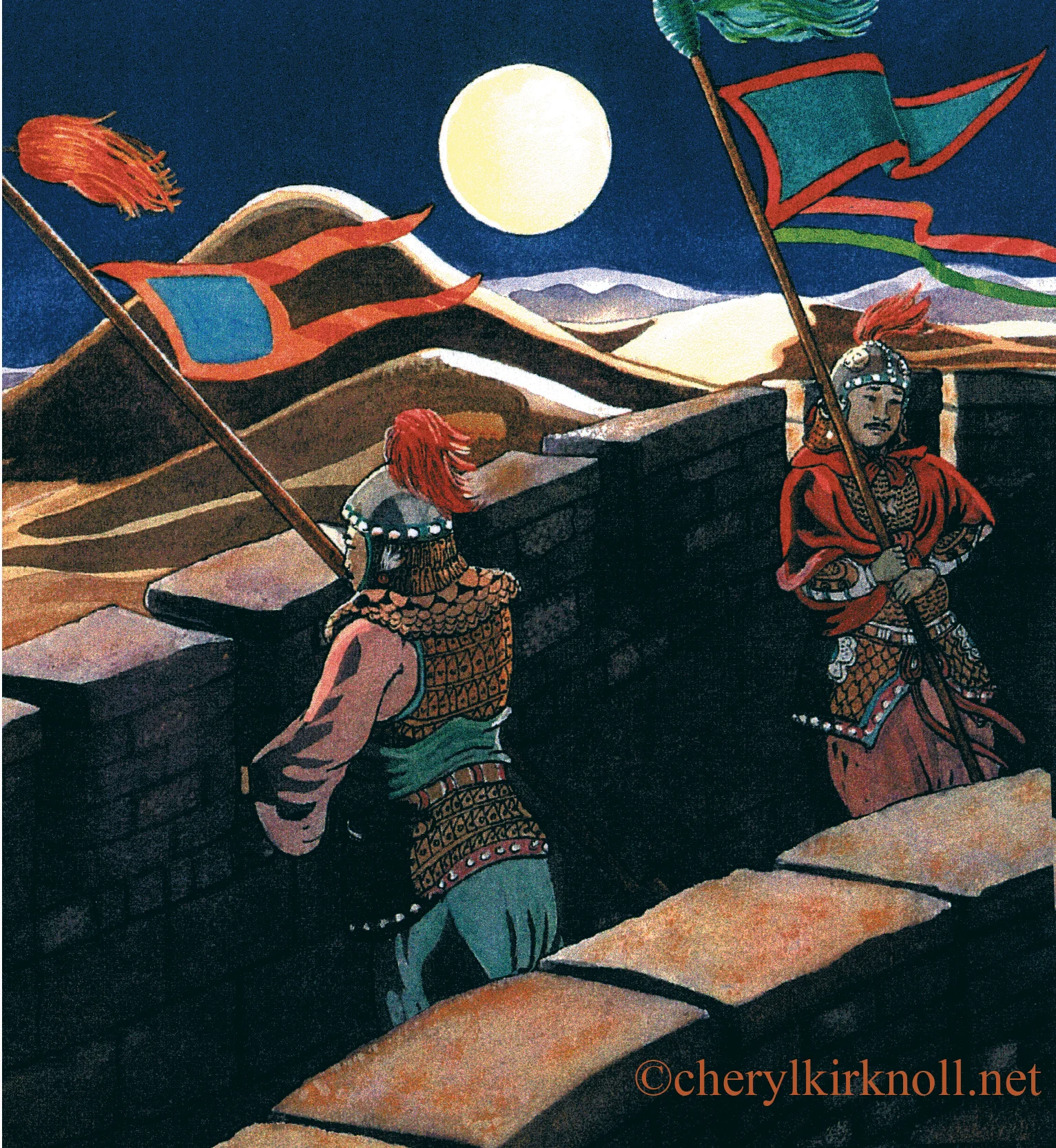
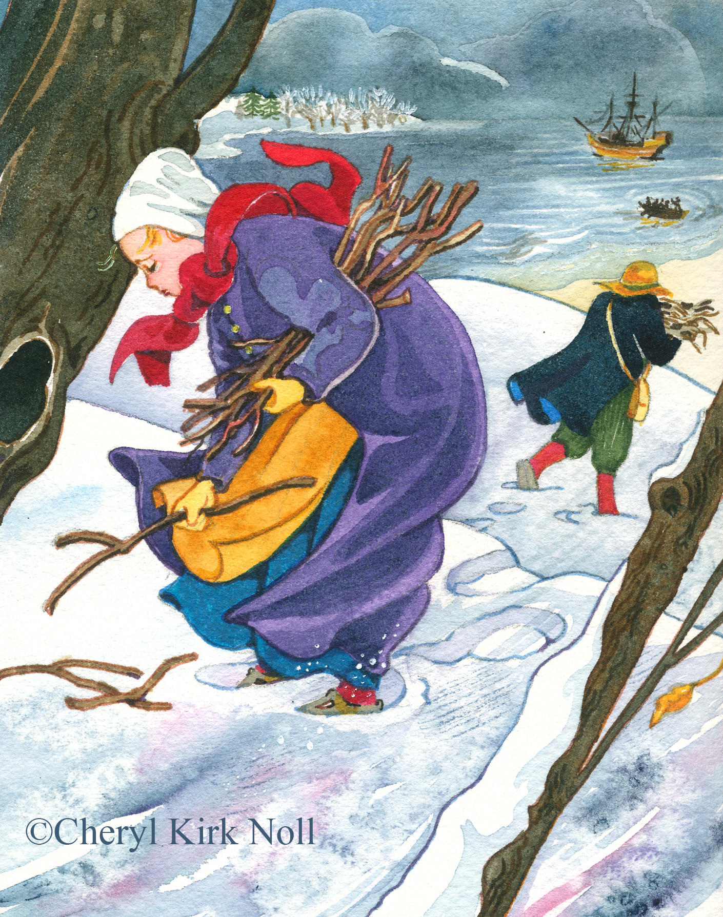
Today, we're having a blizzard watch in New England, winds howling, snow/sleet pelting, and I'm snug inside. Here's an old piece from a Scholastic book I illustrated about Squanto's role in the founding of Plymouth. Sure am glad I don't have to gather wood for the fire!!! (Blueberry pancakes and bacon coming up!)
©Cheryl Kirk Noll, #amaranth @colour_collective


Watercolor Workshop Class at RISD-CE, 2017